
#-1 | Inside a Self-Organising Map
When I first heard of self-organising maps I wondered were they as cool as their name suggested. I have always been keen to look under the hood and see what the ‘organisation’ process looks like. So I forked the kohonen Package on the CRAN github mirror and gave it a go.
The SOM algorithm
The self-organising map (hereafter SOM) algorithm was introduced by Teuvo Kohonen in the 1980s. There is a good description of it in Elements of Statistical Learning. I will give a more informal and less complete description. The package kohonen implements the algorithm in R. There are a lot of parameters and functionality which I will avoid describing in order to keep things simple. I just want to give a feel for how it all works.
Say we have a bunch of unlabeled data with each observation consisting of n numeric variables. Each observation can be thought of as a point in \(\mathbb{R}^{n}\). The iris data set is a good example. Let’s have a look at it.
  # Use data.table for nice printing.
  print(as.data.table(iris))
## Sepal.Length Sepal.Width Petal.Length Petal.Width Species
## 1: 5.1 3.5 1.4 0.2 setosa
## 2: 4.9 3.0 1.4 0.2 setosa
## 3: 4.7 3.2 1.3 0.2 setosa
## 4: 4.6 3.1 1.5 0.2 setosa
## 5: 5.0 3.6 1.4 0.2 setosa
## ---
## 146: 6.7 3.0 5.2 2.3 virginica
## 147: 6.3 2.5 5.0 1.9 virginica
## 148: 6.5 3.0 5.2 2.0 virginica
## 149: 6.2 3.4 5.4 2.3 virginica
## 150: 5.9 3.0 5.1 1.8 virginicaWe can see it has five columns. Four of these describe dimensions of the flower petal and sepal. The last column tells us which species the flower belongs to. For the time being let’s remove the species column and use the 4 numeric columns to create a self-organising map. We’ll make use of the species column again later on.
dt.iris.unlabeled <- as.data.table(iris[, -which(names(iris) %in% c('Species'))])
dt.iris.unlabeled
## Sepal.Length Sepal.Width Petal.Length Petal.Width
## 1: 5.1 3.5 1.4 0.2
## 2: 4.9 3.0 1.4 0.2
## 3: 4.7 3.2 1.3 0.2
## 4: 4.6 3.1 1.5 0.2
## 5: 5.0 3.6 1.4 0.2
## ---
## 146: 6.7 3.0 5.2 2.3
## 147: 6.3 2.5 5.0 1.9
## 148: 6.5 3.0 5.2 2.0
## 149: 6.2 3.4 5.4 2.3
## 150: 5.9 3.0 5.1 1.8So in this case we can think of each row as a vector in \(\mathbb{R}^{4}\). The goal of SOM is to find k points in \(\mathbb{R}^{n}\) that each act as some sort of representative of a different subset of the data. The kohonen package in R calls these codes. This is the aim of many clustering algorithms. SOM goes further by enumerating the codes and arranging them in a 2 dimensional grid. For example if k is 16 we can have a 4x4 grid.
plot(somgrid(xdim=4, ydim=4))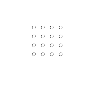
Once the codes are arranged like this they all have neighbours. Each code has 8 neighbours unless it it on the edge in which case it has 3 (you can also use a hexagonal grid where each code has 6 neighbours). The SOM algorithm works so that neighbours on the SOM grid stay close to each other in \(\mathbb{R}^{n}\). The codes are determined in such a way so that if they are close to each other in the map, then they will be near to each other in \(\mathbb{R}^{n}\). So the grid is kind of like a ‘map’ of the feature space. Elements of Statistical Learning describes this in detail. Interestingly it also states that SOM can be thought of as a constrained form of K-means, but that’s not for now.
Let’s get back to the iris data and briefly demonstrate how SOM can be useful.
Iris
First let’s generate a map. I have just used the default configuration. The point here is not to show how to best produce a map, but rather to show how an SOM can be useful.
som.grid <- somgrid(5, 5)
# center and scale the data since we want to treat all features as equally important
dt.iris.unlabeled.scaled <- as.data.table(scale(dt.iris.unlabeled))
som.model <- som(as.matrix(dt.iris.unlabeled.scaled),
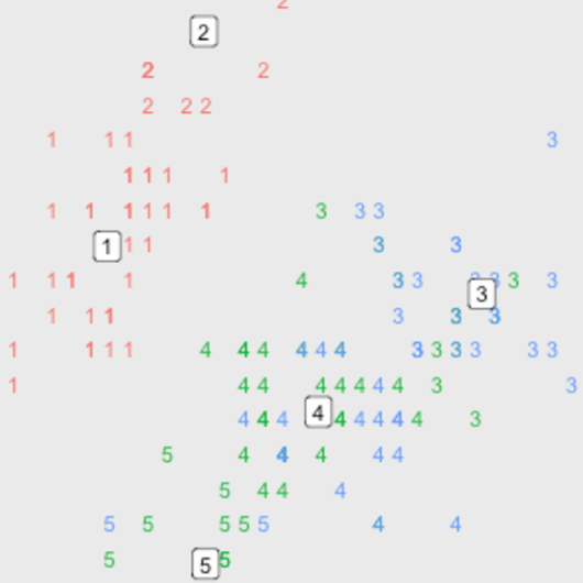
som.grid)The SOM has been produced using the unlabeled data. The plot below uses plot.kohonen with type=mapping to show the different species that have been assigned to each code i.e. we now layer the species information on top of the map.
# Here's a mapping of species to the id used to represent them on the map
print(data.table(Species=levels(iris$Species)))
## Species
## 1: setosa
## 2: versicolor
## 3: virginicaplot(som.model, type="mapping", labels=as.numeric(iris$Species),
col=as.numeric(iris$Species))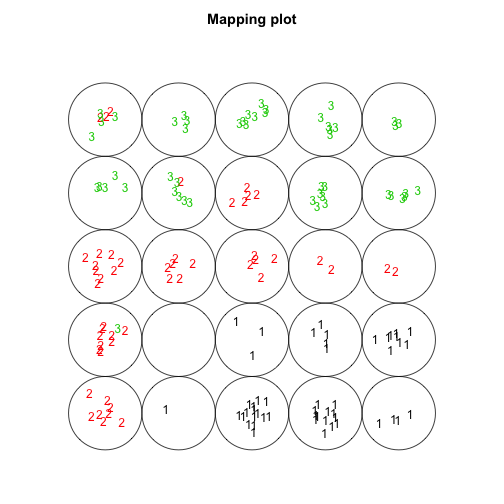
(Note that there is one code that doesn’t have any flowers in it which isn’t ideal - however this isn’t really a problem for the current demonstration.)
From the plot we can make the following observations:
- The setosa species (1s) seems to be separate from the other two species. This could be investigated further using the other kohonen plots. For instance we can plot the total distance of each code from its neighbours with
type=dist.neighbours. We can see a boundary of sorts around the 4 setosa species codes indicating a gap between these codes and the others.
plot(som.model, type="dist.neighbours")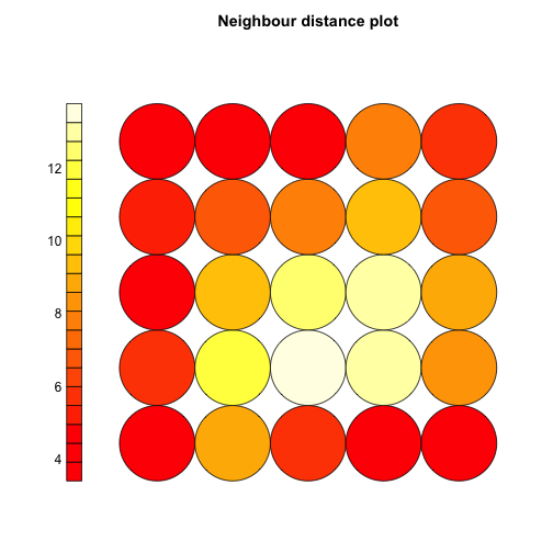
- The versicolor and virginica (2s and 3s) species can nearly be separated. We can use the plot to identify potentially interesting flowers by looking at codes with a mix of the two species. For instance in code 6 there are 9 versicolor and 1 virginica. This virginica flower might be of interest given it’s so similar to many versicolor flowers and is so far away from the other virginica flowers.
# Code 1 is on the bottom left with the code numbers incrementing horizontally
# up to code 5. Code 6 is above code 1 on the next row up.
iris[som.model$unit.classif==6, ]## Sepal.Length Sepal.Width Petal.Length Petal.Width Species
## 60 5.2 2.7 3.9 1.4 versicolor
## 68 5.8 2.7 4.1 1.0 versicolor
## 70 5.6 2.5 3.9 1.1 versicolor
## 80 5.7 2.6 3.5 1.0 versicolor
## 83 5.8 2.7 3.9 1.2 versicolor
## 90 5.5 2.5 4.0 1.3 versicolor
## 91 5.5 2.6 4.4 1.2 versicolor
## 93 5.8 2.6 4.0 1.2 versicolor
## 95 5.6 2.7 4.2 1.3 versicolor
## 107 4.9 2.5 4.5 1.7 virginicaWe can also use the codes option of plot.kohonen to see what each of the codes look like.
plot(som.model, type="codes")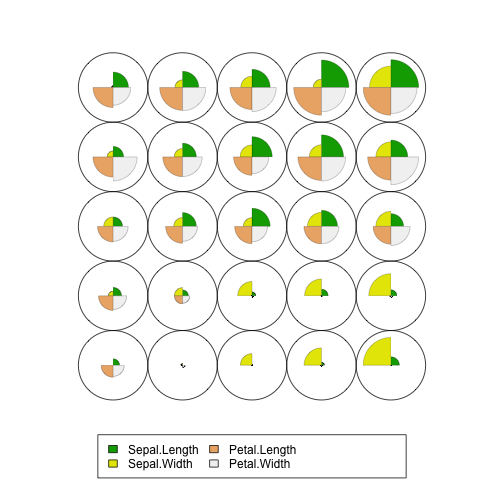
From this plot we can observe:
-
The setosa species appears to vary mostly by sepal width with its petal length and petal width being smaller than the other species.
-
The versicolor and virginica species (2s and 3s in the plot above) seem to vary mostly by their sepal length and sepal width.
Inside an SOM
Hopefully the examples above show how an SOM can be useful for understanding a high dimensional data set. Now let’s look at how the map ‘organises’ itself. Since we can’t visualise 4 dimensions let’s simplify things and just use two columns of the iris data set. Moreover, since reducing 2 dimensions to 2 dimensions isn’t very worthwhile, instead let’s reduce from 2 dimensions to 1 i.e. we specify an 5x1 SOM grid.
# Just use two dimensions
dt.iris.unlabeled.scaled.sepal.only <- dt.iris.unlabeled.scaled[, .(Sepal.Length, Sepal.Width)]
# Create a new grid
som.grid <- somgrid(5, 1, topo = 'rectangular')
# run SOM
som.model <- som(as.matrix(dt.iris.unlabeled.scaled.sepal.only),
som.grid)
# Create mapping plot
plot(som.model, type="mapping", labels=as.numeric(iris$Species),
     col=as.numeric(iris$Species))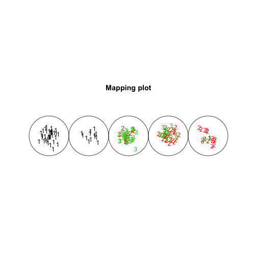
It kind of looks like a caterpillar. Of course since the dimensions are low we can visualise the location of each code, the code represents each data point and the species of each data point (using colour).
  dt.caterpillar.2d <- dt.iris.unlabeled.scaled.sepal.only[, code := som.model$unit.classif]
  dt.caterpillar.2d[, Species := iris$Species]
  dt.caterpillar.2d.codes <- as.data.table(som.model$codes)
  dt.caterpillar.2d.codes[, code := 1:.N]
  ggplot(dt.caterpillar.2d, aes(x=Sepal.Length, y=Sepal.Width)) +
    geom_text(aes(label=code, color=Species)) +
    geom_label(aes(x=Sepal.Length, y=Sepal.Width, label=code), dt.caterpillar.2d.codes) +
    theme(panel.grid.major=element_blank(),
          panel.grid.minor=element_blank())
Let’s see how all this come about. In the SOM algorithm the entire data set is shown to the algorithm many times - the default in the kohonen package (parameter rlen) is 100 times. The iris dataset has 150 observations, so in the examples above 15,000 data points are shown to the algorithm in total.
Each time a data point \(d\) is shown to the algorithm, the position of the code nearest to the data point and the neighbours of this code are updated based on:
\[x_i = x_i + \alpha (d_i - x_i)\]where \(x_i\) and \(d_i\) are the ith component of \(x\) and \(d\) in \(\mathbb{R}^{n}\) and \(\alpha\) is the learning rate. The default is for the learning rate \(\alpha\) to decrease linearly from 0.05 to 0.01 over each pass of the full dataset.
Even though I knew how all this worked I wanted to better understand what this process looks like. So I forked the kohonen package from the CRAN read only mirror and added some code to record the positions of the codes after each data point is shown to the algorithm. The result was then used to create an animation of the map organising itself.
Animating
The animation package in R is great for animating! To animate we need a function that can create a plot of the codes of the SOM at a given snapshot. Here’s the function I used, it’s a bit messy but does the job. You can see the results below.
# Plots the given codes, the current and previous data point shown to the SOM
# and also some annotation to explain what's going on. dt is the full dataset.
PlotSOMSnapshot <- function(dt, codes, current, previous, r, next.data.point=TRUE) {
  # Create a copy of dt so that we can add columns without worrying about
  # oife outside this function.
  dt.anim <- copy(dt)
  # Add columns to handle current and previous data points.
  dt.anim[, the.datum := ifelse(.I==current, 'current', ifelse(.I==previous, 'previous', 'no'))]
  dt.anim[, the.size := ifelse(.I==current, 6, ifelse(.I==previous, 3, 2))]
  the.colours <- c('current'='red', 'previous'='purple', 'no'='grey')

  # Prep the codes
  dt.codes <- as.data.table(codes)
  dt.codes[, code := 1:.N]
  setnames(dt.codes, c('Sepal.Length', 'Sepal.Width', 'code'))

  # Create plot
  p <- ggplot(dt.anim, aes(x=Sepal.Length, y=Sepal.Width)) +
    geom_label(data=dt.codes,
               mapping=aes(x=Sepal.Length, y=Sepal.Width, label=code),
               size=4) +
    annotate('text',
             x=-0.9,
             y=-2.5,
             label=paste0('Data shown to SOM ', round(r, 2), ' times.'),
             size=5) +
    theme(panel.grid.major = element_blank(),
          panel.grid.minor = element_blank(),
          axis.line=element_blank(),
          axis.text.x=element_blank(),
          axis.text.y=element_blank(),
          axis.ticks=element_blank(),
          axis.title.x=element_blank(),
          axis.title.y=element_blank(),
          legend.position="none")

  # Highlight the next and previous data points if we want
  if (next.data.point) {
    p <- p + scale_color_manual(values=the.colours) +
          annotate('text', x= 1, y=-2.5, label='Next', size=5, color='red') +
          annotate('text', x= 2, y=-2.5, label='Previous', size=5, color='purple') +
          geom_point(aes(color=the.datum, size=the.size))
  } else {
        p <- p + geom_point(color='grey')
  }

  plot(p)
}
One observation at a time
First let’s look at 20 consecutive iterations of the algorithm at different stages of the learning process. This will help us get a feel for
- the nearest code to the data point moving towards the data point
- the neighbours of the nearest code moving towards the data point
- the learning rate changing over the course of the algorithm
Here we use the SaveVideo function of the animation package but there appear to be functions to create animations in many other formats. You pass in a block of code that creates the plots to be used in the animation. Here I make use of the snapshot functionality I added to my forked version of the kohonen package. The list returned by the forked version of the algorithm has two extra elements
code_snapshotswhich is a large matrix containing the positions of each code at each iterationcode_snapshots_datumwhich contains the coordinates of the data point shown to the algorithm at each iteration. I decided to call a data point a datum here…not sure why.
The code below isn’t the prettiest, but it gets the job done and the resulting animations seem to make sense.
dt.iris.unlabeled.scaled.sepal.only[, code := som.model$unit.classif]

saveVideo({
  for (i in 500:520) AnimateSOM(dt.iris.unlabeled.scaled.sepal.only,
                               som.model$code_snapshots[,,i],
                               som.model$code_snapshots_datum[i+1],
                               som.model$code_snapshots_datum[i],
                               i/nrow(dt.iris.unlabeled.scaled.sepal.only))
}, '~/Google Drive/som_anim_small_one.mp4')


saveVideo({
  for (i in 1500:1520) AnimateSOM(dt.iris.unlabeled.scaled.sepal.only,
                               som.model$code_snapshots[,,i],
                               som.model$code_snapshots_datum[i+1],
                               som.model$code_snapshots_datum[i],
                               i/nrow(dt.iris.unlabeled.scaled.sepal.only))
}, '~/Google Drive/som_anim_small_two.mp4')

saveVideo({
  for (i in 4500:4520) AnimateSOM(dt.iris.unlabeled.scaled.sepal.only,
                               som.model$code_snapshots[,,i],
                               som.model$code_snapshots_datum[i+1],
                               som.model$code_snapshots_datum[i],
                               i/nrow(dt.iris.unlabeled.scaled.sepal.only))
}, '~/Google Drive/som_anim_small_three.mp4')
First we look at the SOM learn early on in the algorithm. We can see at the bottom of the video that the entire data set has been shown to the SOM 3 times so far and we are a third of a way through the fourth run. The big red dot is the next data point that will be shown to the algorithm. The nearest code to the red dot moves towards it and also pulls some of its neighbours along with it. The purple dot is the previous data point.
The next video starts with the full data set having already been shown to the algorithm 10 times and we are starting the 11th run. The learning rate is lower now and we can see that codes positions do not update as much as before.
Next the video starts with the full data set having already been shown to the algorithm 30 times and we are starting the 31st run. The learning rate is much lower now and we can see that the codes move very little.
The Bigger Picture
Behind the scenes the som algorithm in the kohonen package keeps track of the mean distance to the nearest code for each full pass through of the dataset.
plot(som.model, type='changes')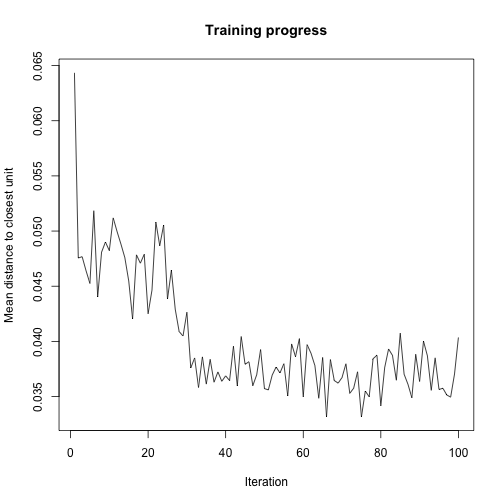
We can see that the biggest decrease in this happens roughly between run 20 and run 40. So let’s look at a video of this but this time looking from run to run rather than from observation to observation.
full.data <- seq(from=0 ,to=nrow(dt.iris.unlabeled)*100 , by=nrow(dt.iris.unlabeled))
full.data[1] <- 1
# Note the interval parameter used here speeds up the animation!
saveVideo({
  for (i in full.data) PlotSOMSnapshot(dt.iris.unlabeled.scaled.sepal.only,
                               som.model$code_snapshots[,,i],
                               som.model$code_snapshots_datum[i+1],
                               som.model$code_snapshots_datum[i],
                               i/nrow(dt.iris.unlabeled.scaled.sepal.only),
                               next.data.point=FALSE)
}, '~/Google Drive/som_anim_full_passes.mp4', interval=0.25)
First we look at a video of run 1 to run 100 and we can see how the codes set into their final positions around run 35.
Finally let’s look at run 24 to 35 at an observation by observation level. In particular, pay attention to run 30 onwards as this is where the codes find their final positions. There appears to be a crucial few iterations where the codes click into their final positions.
the.big.change.data <- seq(from=nrow(dt.iris.unlabeled)*25 ,to=nrow(dt.iris.unlabeled)*35 , by=1)
saveVideo({
  for (i in the.big.change.data) PlotSOMSnapshot(dt.iris.unlabeled.scaled.sepal.only,
                               som.model$code_snapshots[,,i],
                               som.model$code_snapshots_datum[i+1],
                               som.model$code_snapshots_datum[i],
                               i/nrow(dt.iris.unlabeled.scaled.sepal.only),
                               next.data.point=TRUE)
}, '~/Google Drive/som_anim_approaching_convergence.mp4', interval=0.10)
Knowledge vs Understanding
For me this little experiment is a demonstration of knowledge vs understanding. This video from Smarter Every Day explains this nicely and there is also an analogous clicking into place moment.
I knew how a self-organising map works but I didn’t understand. Looking under the hood certainly helped me to understand why the algorithm works. I found it very useful to see how the codes and their neighbours all move together and how this is key to creating a ‘map’. By seeing the position of the codes as the algorithm progresses we can get a really good feel for how the algorithm is working.
In the iris example there appears to be a prolonged period where the codes are being dragged all over the place - roughly 30 full passes of the data. Then suddenly the codes click into place. I find it interesting how the repeated application of simple operations can lead to this complex behaviour. I won’t attempt to explain this any further. I would much rather leave you with the impression of the videos above.